개발일지/CSS
[CSS] iOS 사파리, 크롬 height: 100vh 버그 해결 방법
zineeworld
2021. 6. 16. 00:18
반응형
문제상황
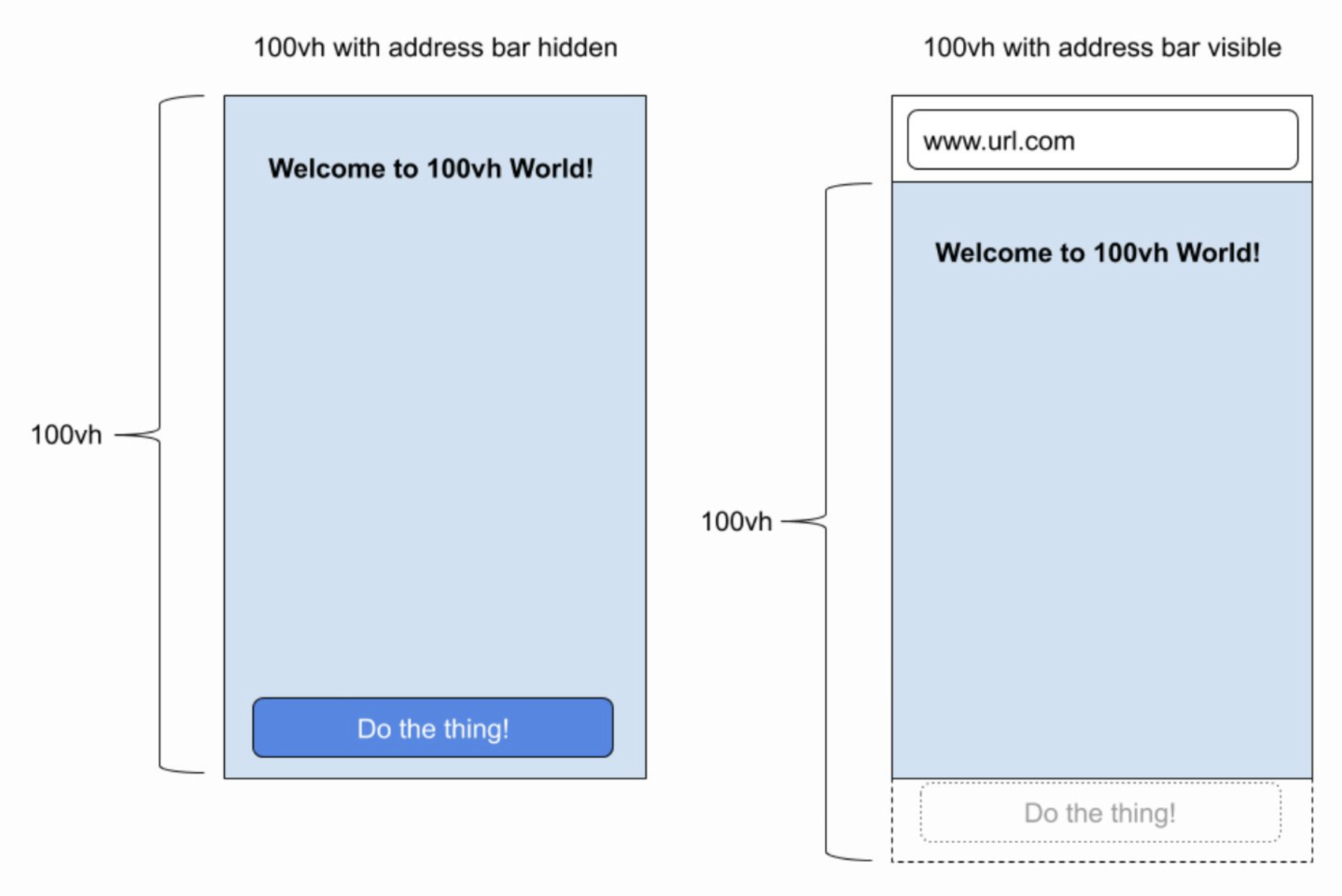
iOS 기기 브라우저에서 100vh 를 브라우저의 도구바 영역까지 잡고 있어서 하단에 무언가 배치하면 (이를테면 아래로 버튼이라던가) 가려서 안보이는 현상이 있다. 정확한 영역을 못잡고 있다는 건데 예전에 해결하던 CSS 핵 방법이 지금은 먹히지 않아서 다른 방법을 찾아보았다.
해결방법
https://css-tricks.com/the-trick-to-viewport-units-on-mobile/
The trick to viewport units on mobile | CSS-Tricks
Viewport units have always been controversial and some of that is because of how mobile browsers have made things more complicated by having their own
css-tricks.com

데모
Static Template
5vzjd.codesandbox.io
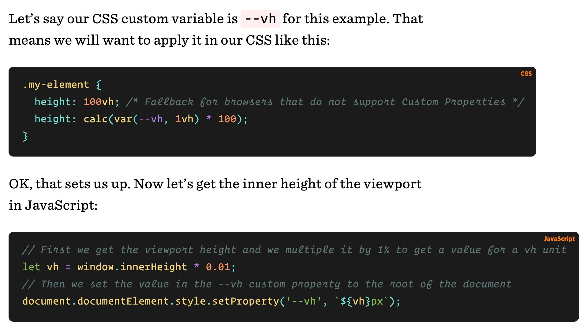
CSS 속성의 100vh을 쓰는게 아니라, 자바스크립트로 실제 높이값을 구해서 1/100 을 해주는 셈이다. 그렇게 1vh의 값을 구한다.
// First we get the viewport height and we multiple it by 1% to get a value for a vh unit
let vh = window.innerHeight * 0.01;
// Then we set the value in the --vh custom property to the root of the document
document.documentElement.style.setProperty('--vh', `${vh}px`);
.my-element {
height: 100vh; /* Fallback for browsers that do not support Custom Properties */
height: calc(var(--vh, 1vh) * 100);
}
반응형