[UI] Instagram NEW LOOK
http://blog.instagram.com/post/144198429587/160511-a-new-look
잘 정리된 국내 리뷰 ▶ https://brunch.co.kr/@sooscape/31
5.18 덧) 네이비색에서 흑백톤으로 바뀐거 말고는 큰 사이를 못 느꼈었는데, 추천 친구 UI가 조금 바뀌었다.
가로 슬라이드 형태로 바뀌었고, 프로필 사진 크기가 커졌다.
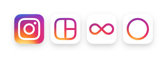
Today we’re introducing a new look. You’ll see an updated icon and app design for Instagram. Inspired by the previous app icon, the new one represents a simpler camera and the rainbow lives on in gradient form.
You’ll also see updated icons for our other creative apps: Layout, Boomerang and Hyperlapse.

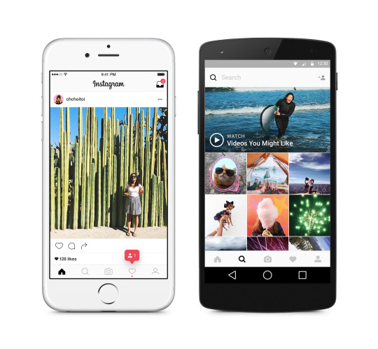
We’ve made improvements to how the Instagram app looks on the inside as well. The simpler design puts more focus on your photos and videos without changing how you navigate the app.

The Instagram community has evolved over the past five years from a place to share filtered photos to so much more — a global community of interests sharing more than 80 million photos and videos every day. Our updated look reflects how vibrant and diverse your storytelling has become.
Thank you for giving this community its life and color. You make Instagram a place to discover the wonder in the world. Every photo and video — from the littlest things to the most epic — opens a window for people to broaden their experiences and connect in new ways.

